
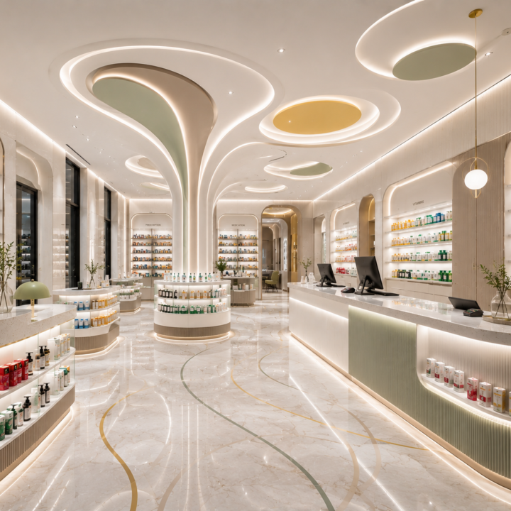
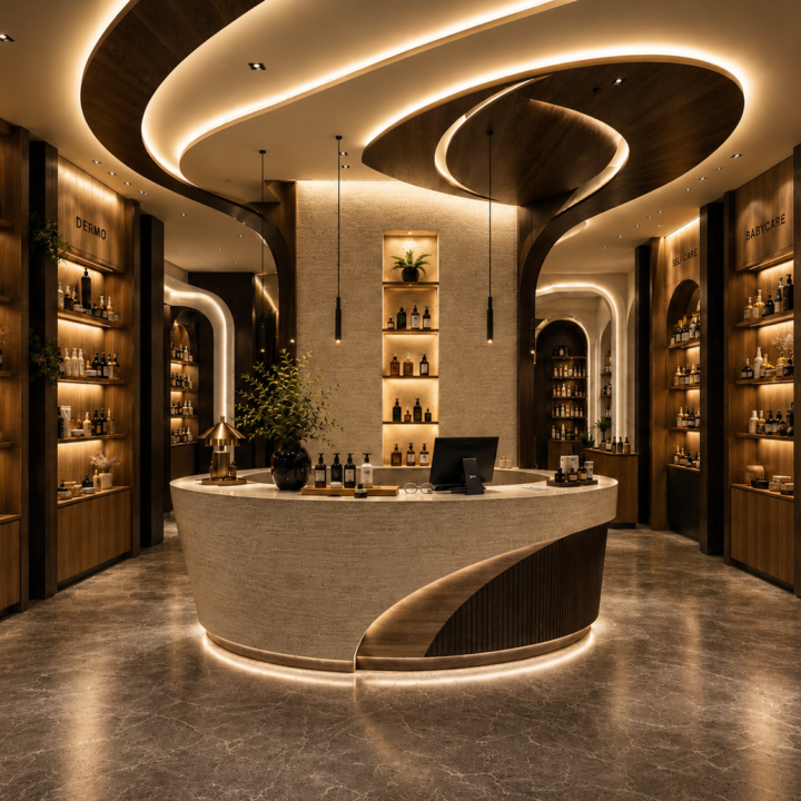
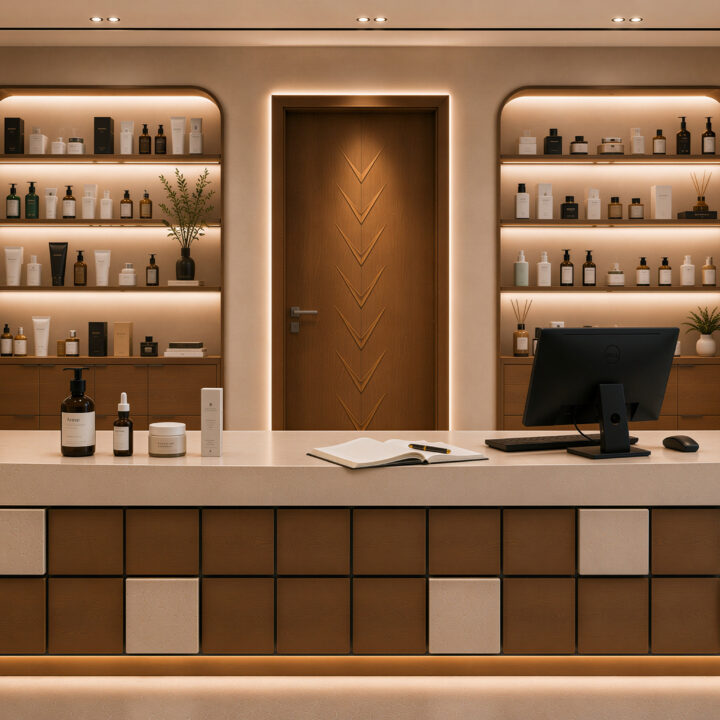
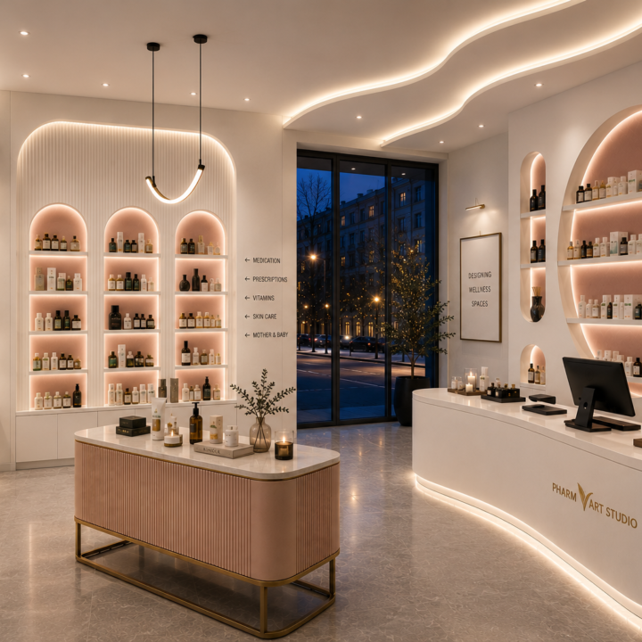

Selected Atmospheres

Design Through the Eyes of a Pharmacist

Designed Through the Eyes of a Pharmacist

Luxury pharmacy interiors shaped by customer psychology, retail strategy, and spatial emotion.

SEE PROJECTS

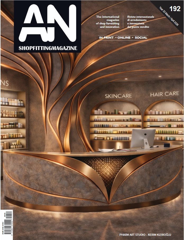
AN Shopfitting Magazine cover featuring a pharmacy design project by Pharm Art Studio

FEATURED IN

AN SHOPFITTING MAGAZINE

Featured on the cover of Issue 192 of AN Shopfitting Magazine.
An international publication dedicated to retail and commercial design.

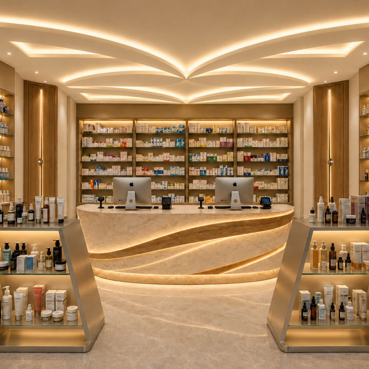
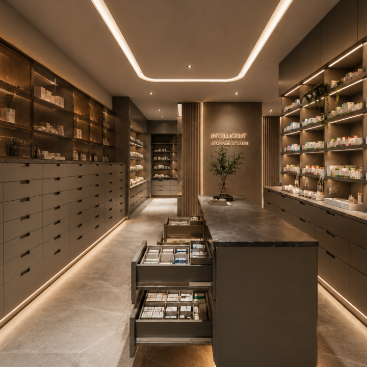
Spatial flow concept designed for intuitive movement and an enhanced patient experience in pharmacy interiors

Flow Planning

We design how customers move inside your pharmacy.
From entrance to counter, every step is intentional.

Lighting Direction

Lighting is not decoration — it’s direction.
We use light to guide attention and support decisions.

Product Visibility

Not every product should compete equally.
We create focal points that guide attention and increase clarity.

Material Balance

Too many materials create noise.
We design calm, refined surfaces that feel premium and timeless.

PHARMACY DESIGN

DERMOCOSMETICS

DISPENSING ZONE

VITAMIN & RETAIL

Completed pharmacy interior design and fit-out projects by Pharm Art Studio

NURHAYAT PHARMACY

Project Overview

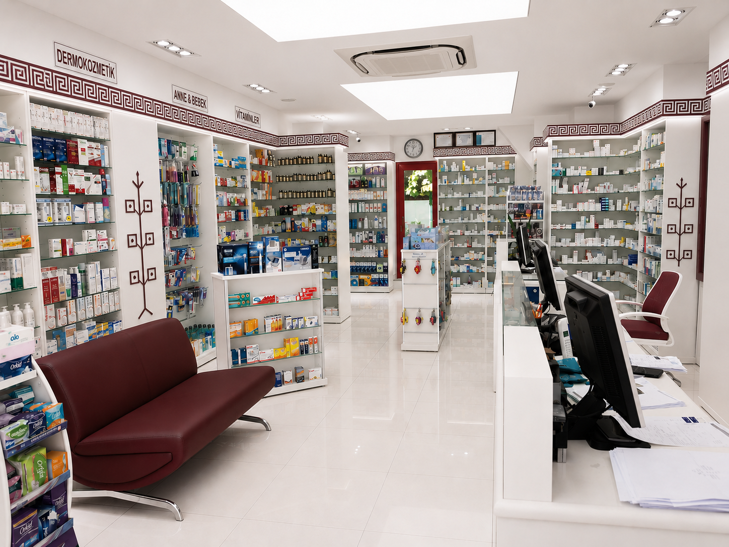
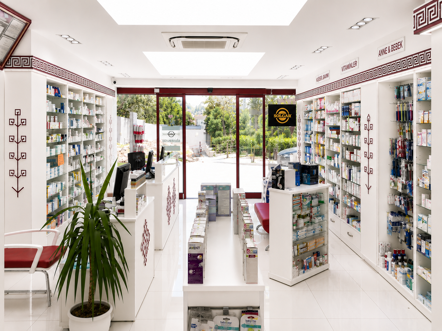
Completed in 2016, Nurhayat Pharmacy was designed for a highly competitive location opposite a major hospital.

Hospital-Facing Planning

A clear central circulation route allows customers to move easily between the entrance, product displays and service counter. The layout was planned to support the fast and continuous customer flow created by the nearby hospital.

Anatolian Motifs

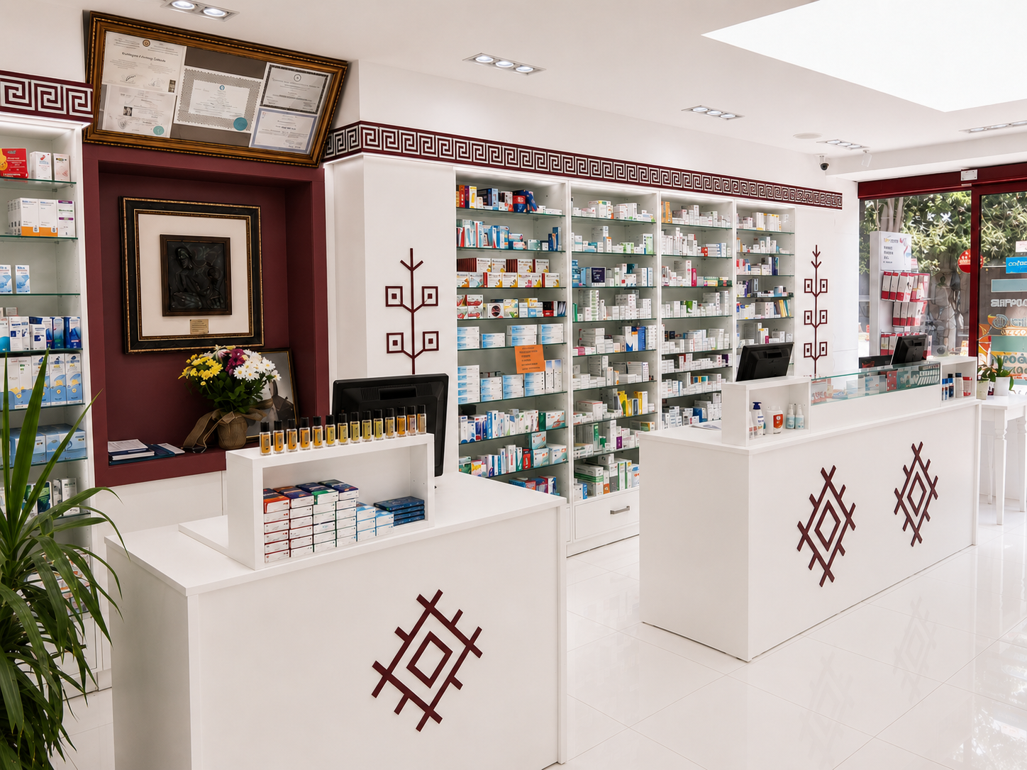
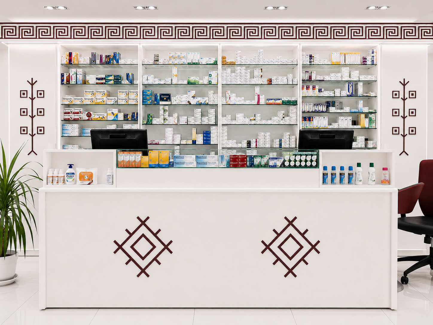
Custom burgundy geometric bands and vertical decorative details introduce references to Anatolian design. These elements give the predominantly white interior a recognizable identity without overwhelming the space.

Display & Service Capacity

Floor-to-ceiling shelving, integrated product displays and a long service counter maximize storage and prescription capacity. Products remain clearly visible and accessible while the interior maintains an orderly appearance.

Material Palette

White lacquered cabinetry, glass shelving, polished flooring and burgundy accents create a bright, durable and cohesive interior. The material selection supports both intensive daily use and the pharmacy’s distinctive visual character.

Pharm Art Studio copper logo representing luxury pharmacy interior design, healthcare architecture and premium retail environments.

PHARMACY INTERIOR DESIGN

From concept to completion.
Real pharmacies. Real results.
Designed to perform.

Spaces shaped by real pharmacy experience, contemporary aesthetics and a deep understanding of customer behavior.

Every layout is designed to improve workflow, product visibility and customer comfort within the pharmacy environment.

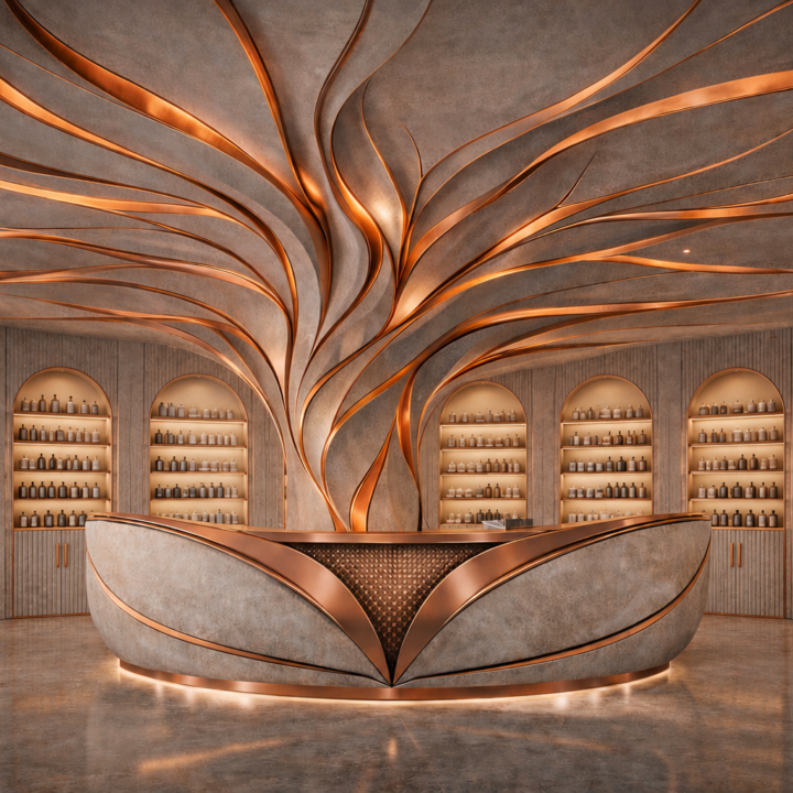
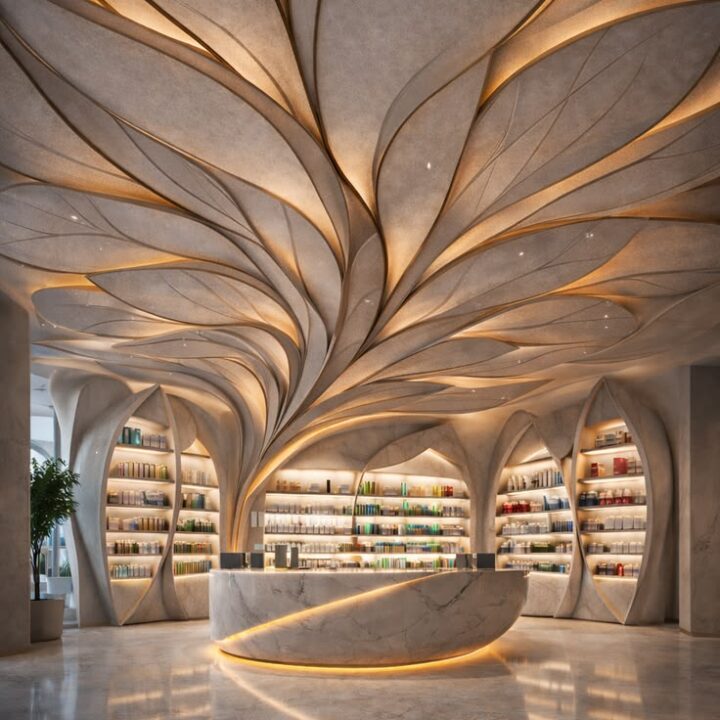
Each project is developed with its own architectural language, material balance and retail atmosphere.