Completed Projects
- Home
- Completed Projects
BARIŞ AKŞİT PHARMACY
Project Overview
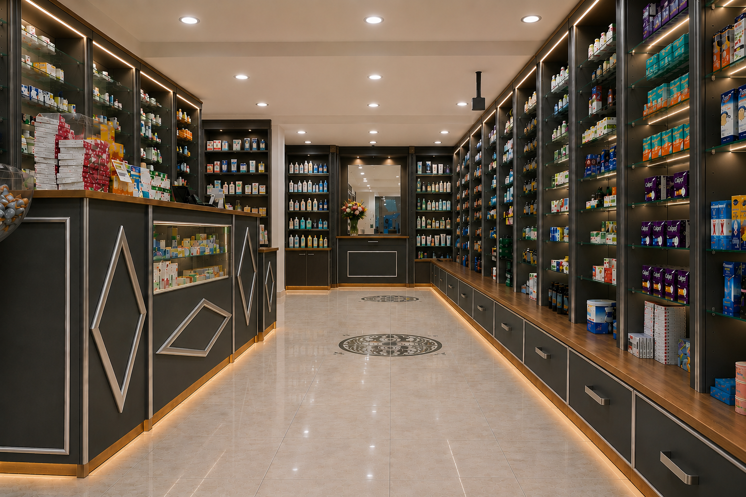
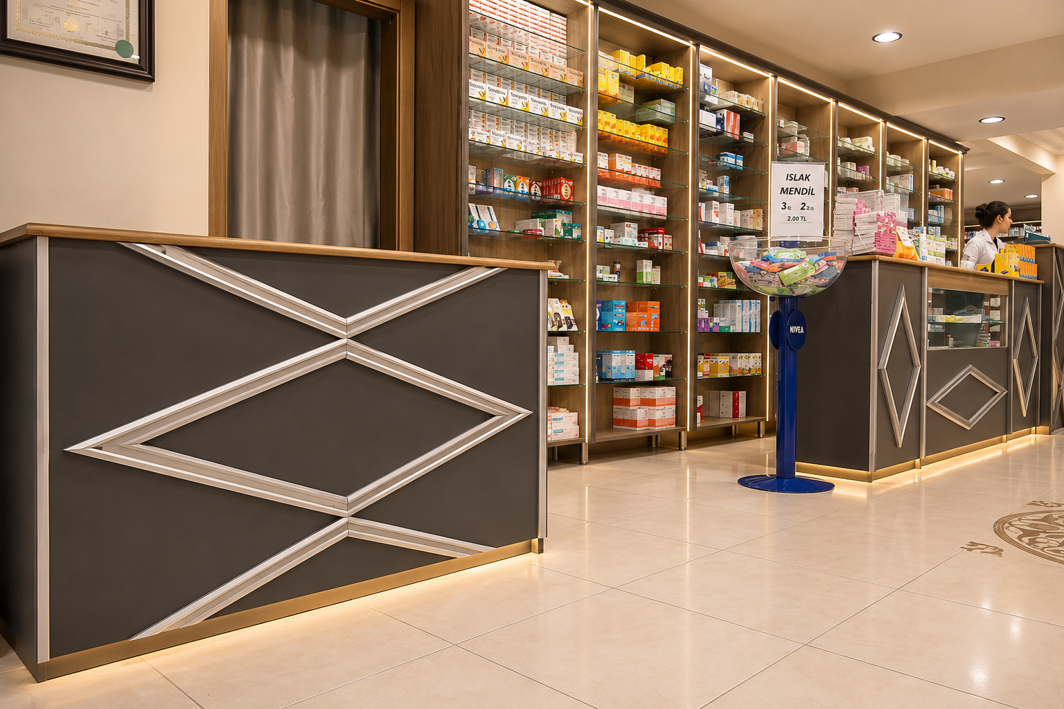
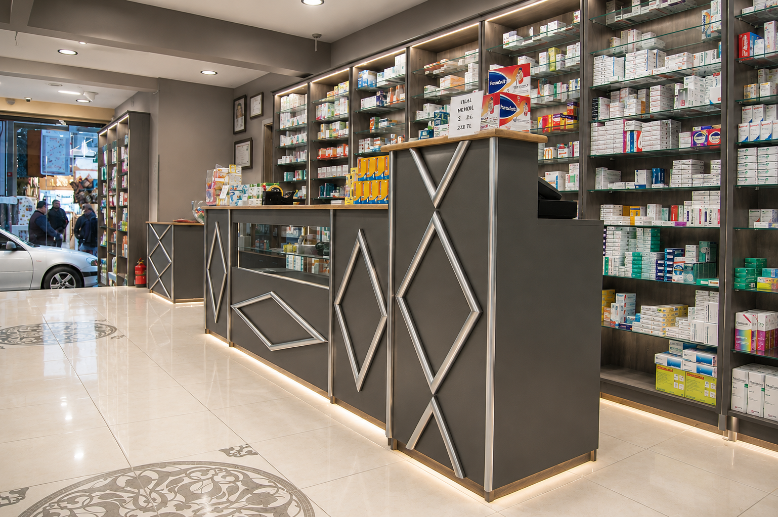
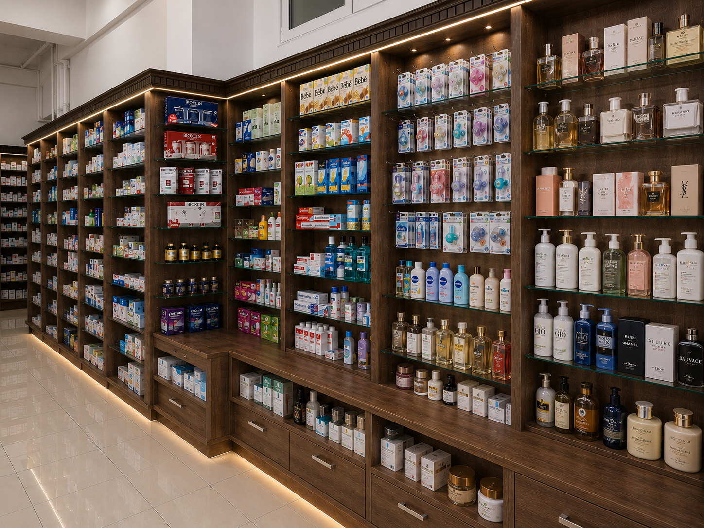
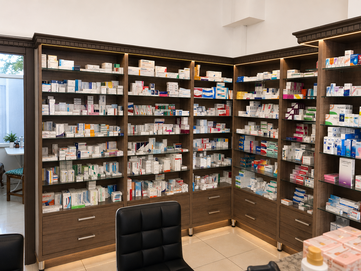
Completed in 2014 on a side street in Kadıköy, Istanbul, Barış Akşit Pharmacy was designed as an elegant neighborhood pharmacy with a strong focus on walk-in retail sales.
Retail-Led Interior
The interior was planned to give non-prescription products a prominent role, using continuous displays and clear product groupings to support browsing and direct sales.
Crafted Material Character
Natural wood surfaces, solid wood detailing and finely executed lacquered elements give the pharmacy a warm, substantial and carefully crafted architectural character.
Display Along the Walls
Tall wall units use the length of the narrow interior efficiently, creating extensive display and storage capacity while preserving a clear central customer route.
Sculpted Service Counter
The custom counter combines dark lacquered surfaces, warm wood and geometric metallic details, forming a distinctive centerpiece at the entrance to the sales area.
GÜLÇE PHARMACY
Project Overview
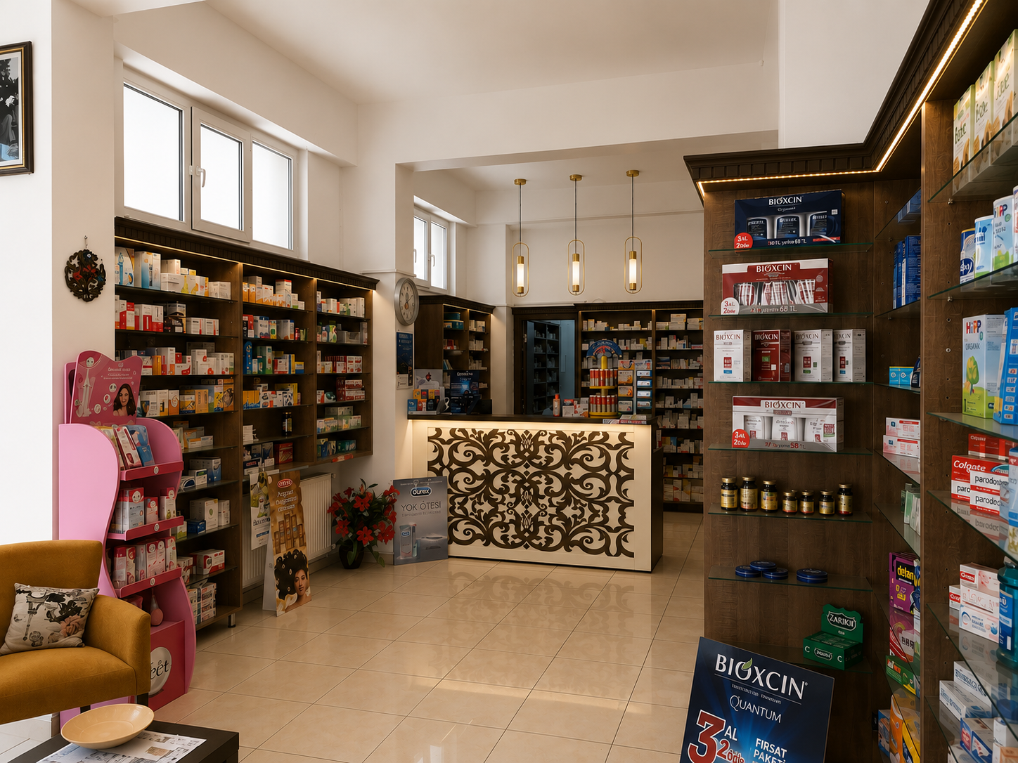
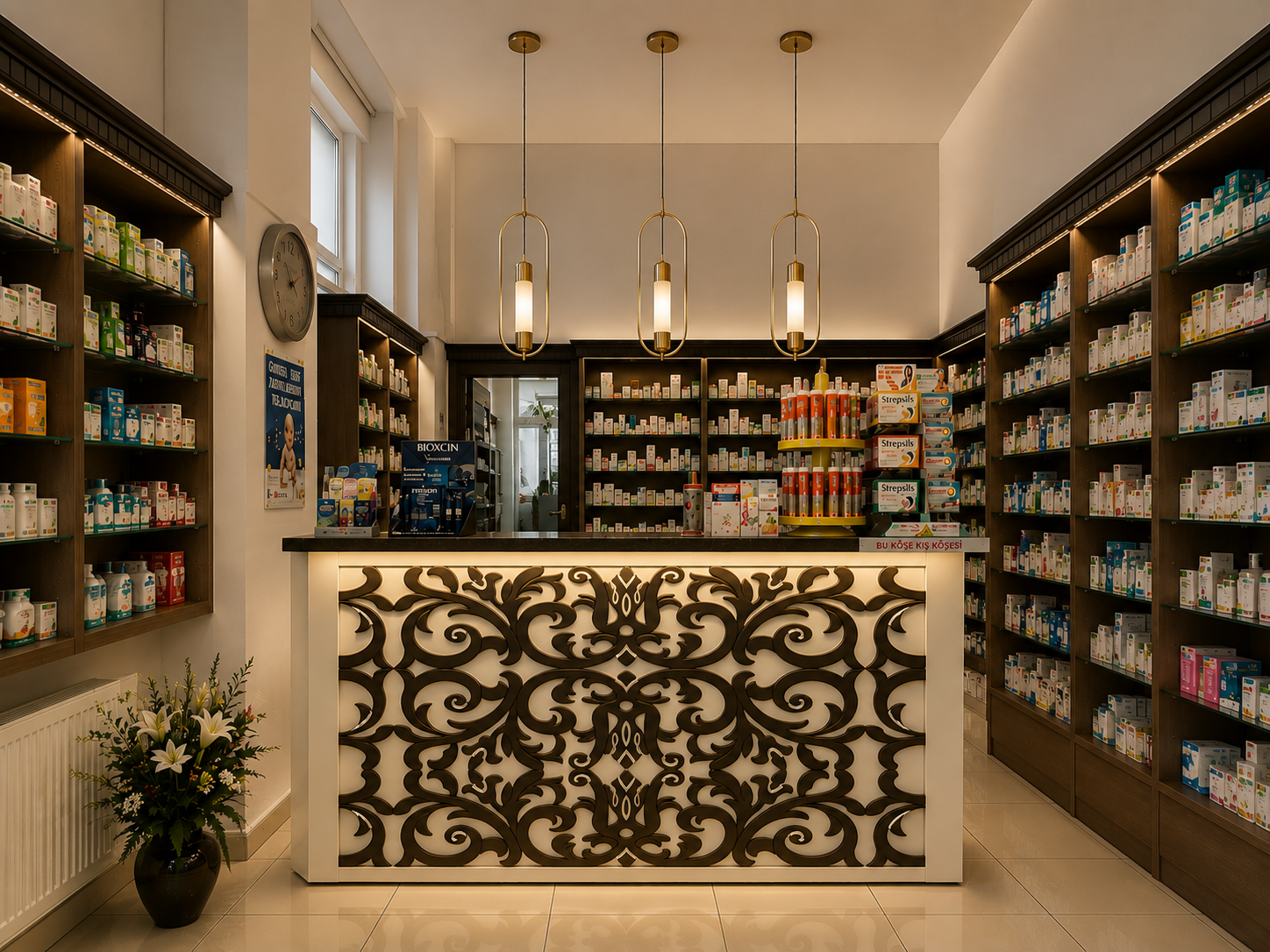
Completed in 2015 Kadıköy, Gülçe Pharmacy was one of the first neighborhood pharmacies to open opposite the newly developed residential complexes. The compact interior was planned as an approachable boutique pharmacy within a controlled budget.
Compact Neighborhood Layout
A clear central route connects the entrance, product displays and service counter, allowing the small interior to function efficiently without feeling congested.
Display Capacity in a Small Footprint
Full-height wall shelving and carefully positioned freestanding units provide extensive product display while preserving an open and practical customer route.
Budget-Conscious Material Strategy
Warm wood finishes, straightforward painted surfaces and efficiently constructed display units create a coherent interior without relying on costly materials or complex detailing.
Decorative Service Counter
The patterned counter front and three pendant lights introduce a distinctive focal point, giving the economical fit-out a more personal and recognizable character.
HAYAT PHARMACY
Project Overview
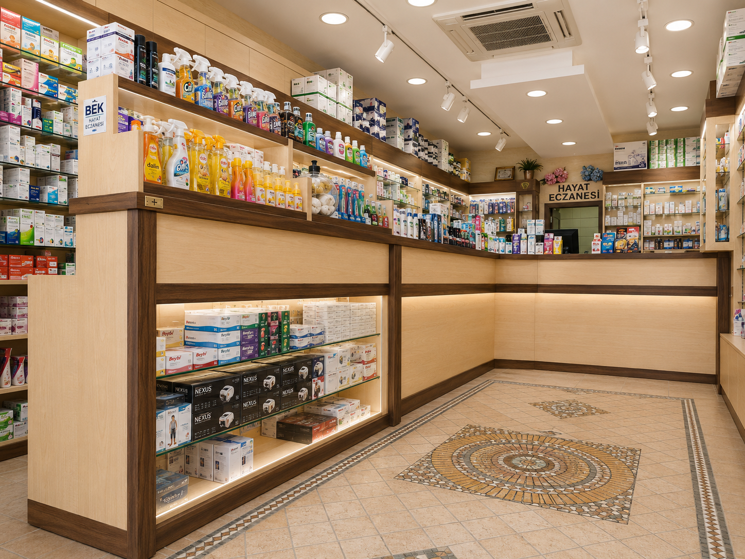
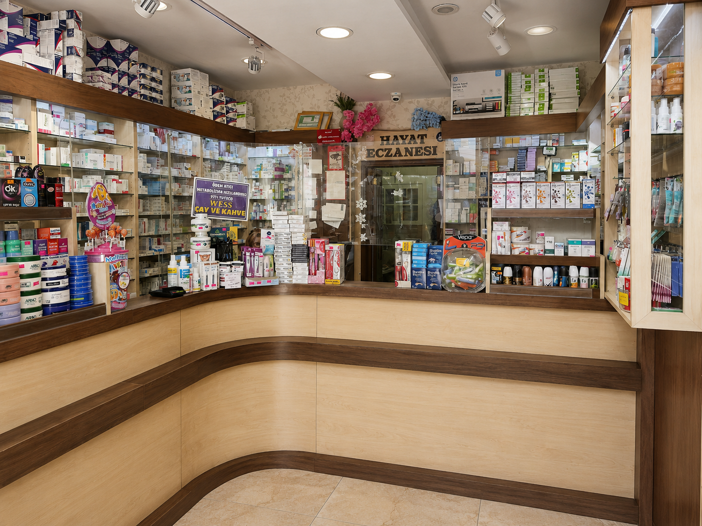
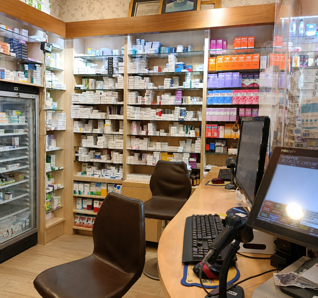
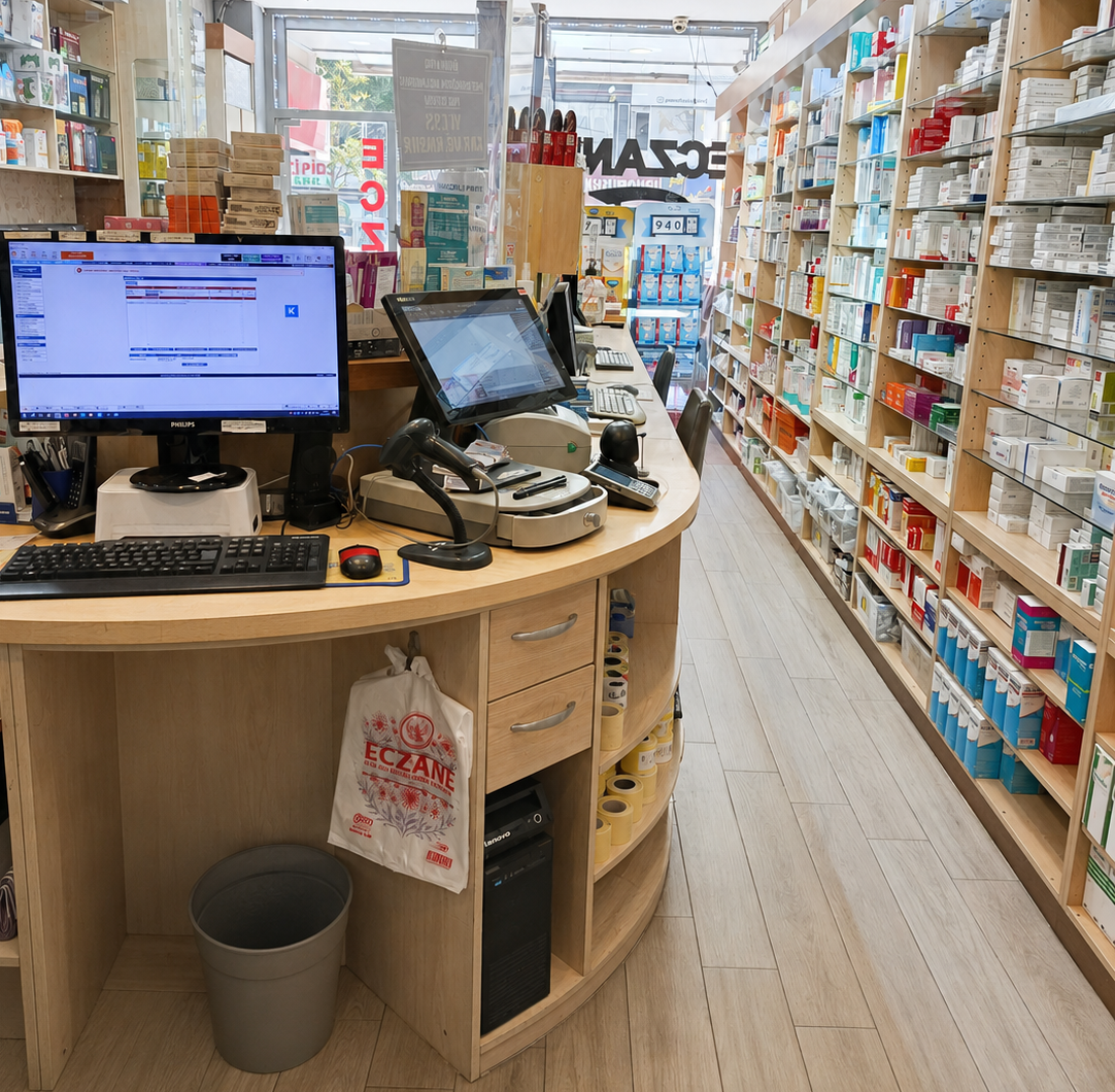
Completed in 2012 in Sultanbeyli, Istanbul, Hayat Pharmacy serves a densely populated district directly beside the entrance of a private hospital. The compact interior was designed to manage high prescription demand and continuous customer traffic efficiently.
High-Volume Prescription Service
The counter layout provides multiple service points within a limited area, allowing pharmacists to receive customers quickly and maintain an efficient workflow during the pharmacy’s busiest periods.
Maximum Use of a Compact Space
Every part of the interior was planned for practical use. The positioning of the counter, circulation route and display units creates maximum operational capacity without making the pharmacy feel congested.
Floor-to-Ceiling Storage
Full-height cabinetry uses every available vertical surface for medicine storage and product display. This high-capacity system keeps a large inventory organized and readily accessible within the compact floor plan.
Maple & Walnut Palette
Light maple surfaces are framed with American walnut details, giving the highly functional interior a warm and structured character. Illuminated glass shelving and decorative ceramic flooring complete the material composition.
KAVAK PHARMACY
Project Overview
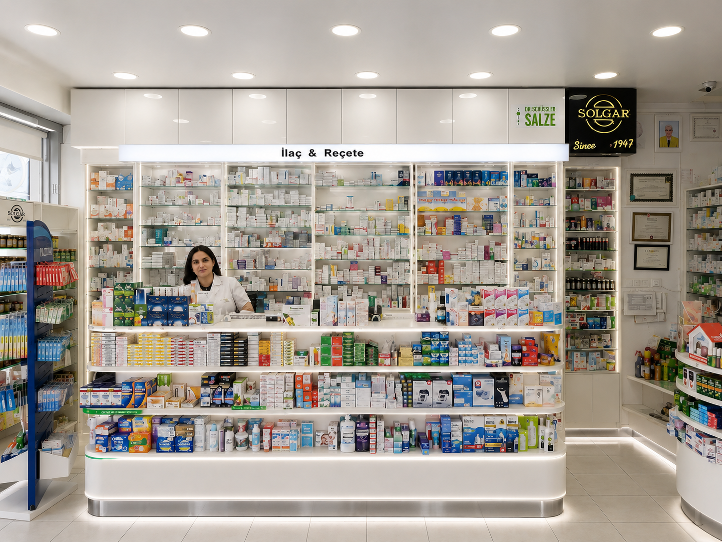
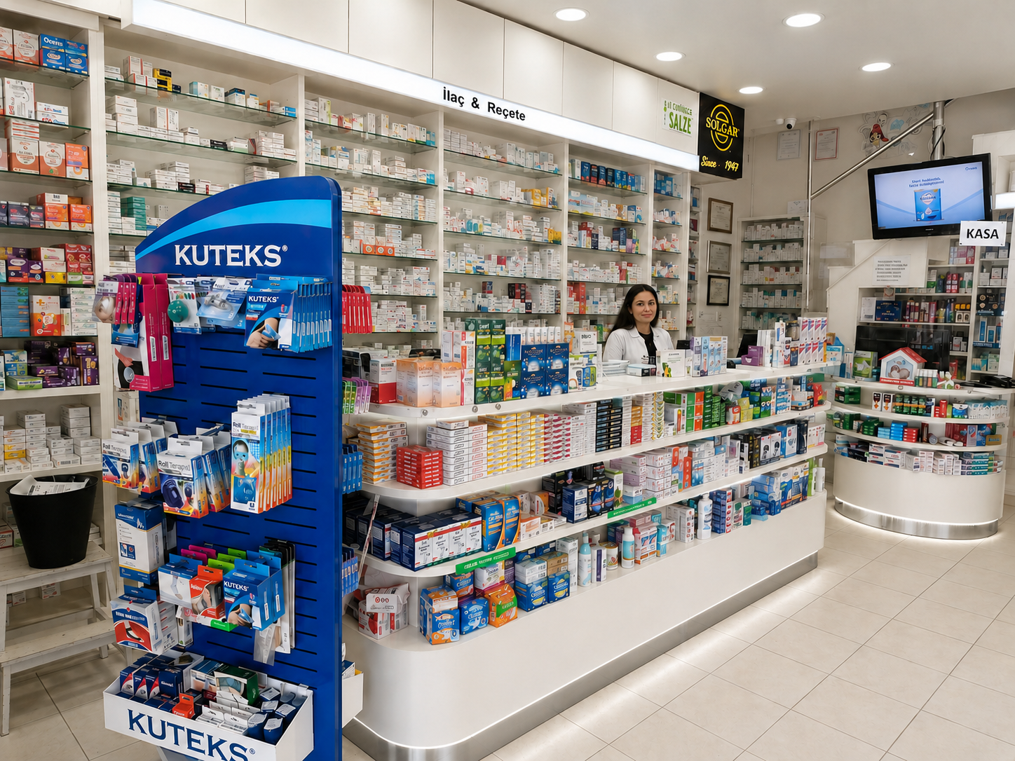
Completed in 2018 in Üsküdar, Istanbul, Kavak Pharmacy was designed for a busy street with intense pedestrian traffic. Its compact ground-floor operation was planned centimetre by centimetre to deliver high product capacity, efficient service and a bright, retail-focused interior.
Maximum Capacity on One Floor
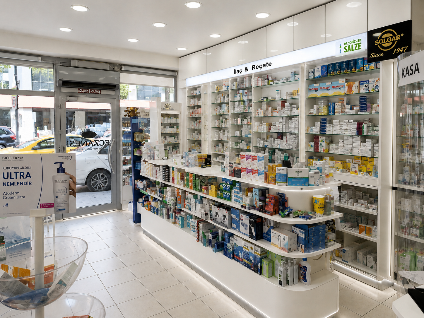
Even though the business occupies a two-level property, the main operation was concentrated on the ground floor. Cabinets, counter areas and circulation routes were designed with exceptional precision so that the compact working area could perform at maximum capacity.
Sliding Storage Systems
Custom sliding cabinets were developed for both medicine storage and dermocosmetic display. These systems increased usable capacity significantly while allowing the pharmacy team to access products quickly and work efficiently throughout the day.
Dermocosmetic Retail Focus
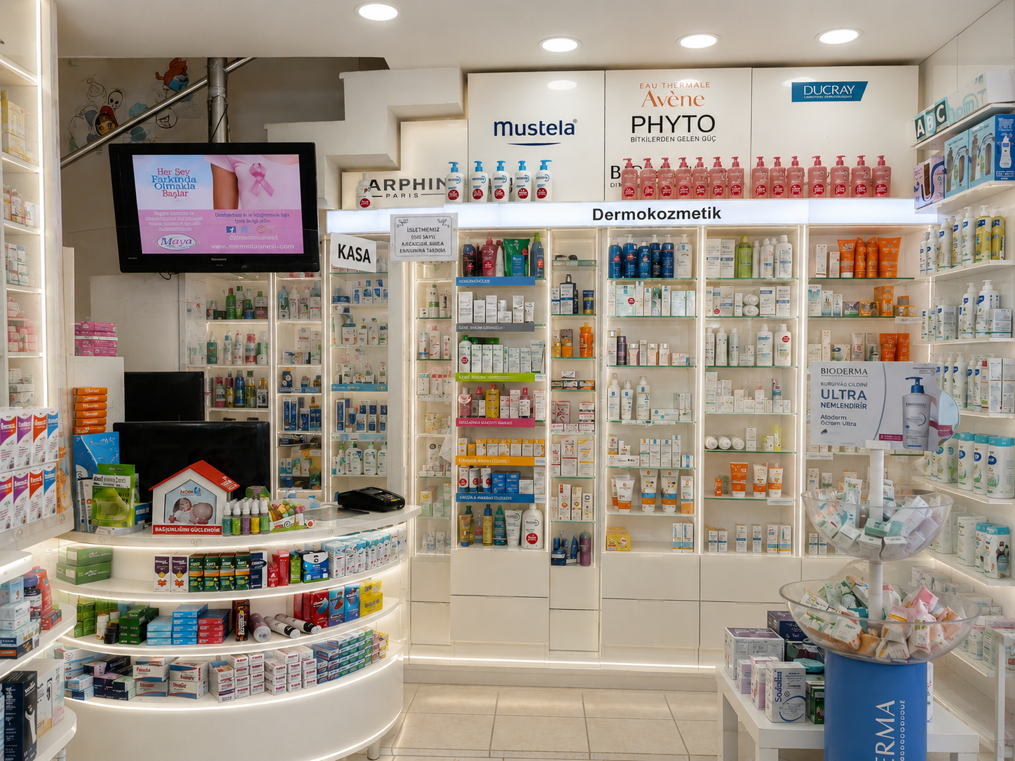
In addition to its strong prescription volume, the pharmacy was designed to support high dermocosmetic sales. Product displays were organized to improve visibility, encourage browsing and turn limited space into an effective retail environment.
Maximum Impact in a Compact Pharmacy
This compact pharmacy design demonstrates how small spaces can achieve strong product visibility, clear circulation and maximum retail impact without feeling crowded. Illuminated displays, precise product zoning and a bright material palette create an open, organized and commercially effective interior.
NURHAYAT PHARMACY
Project Context
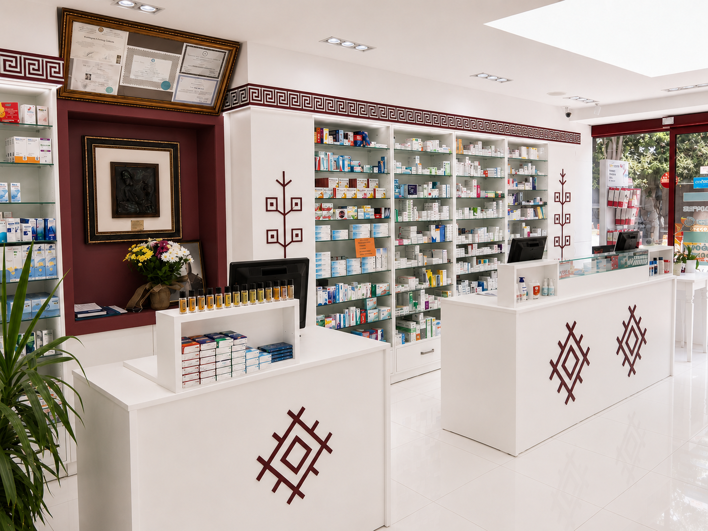
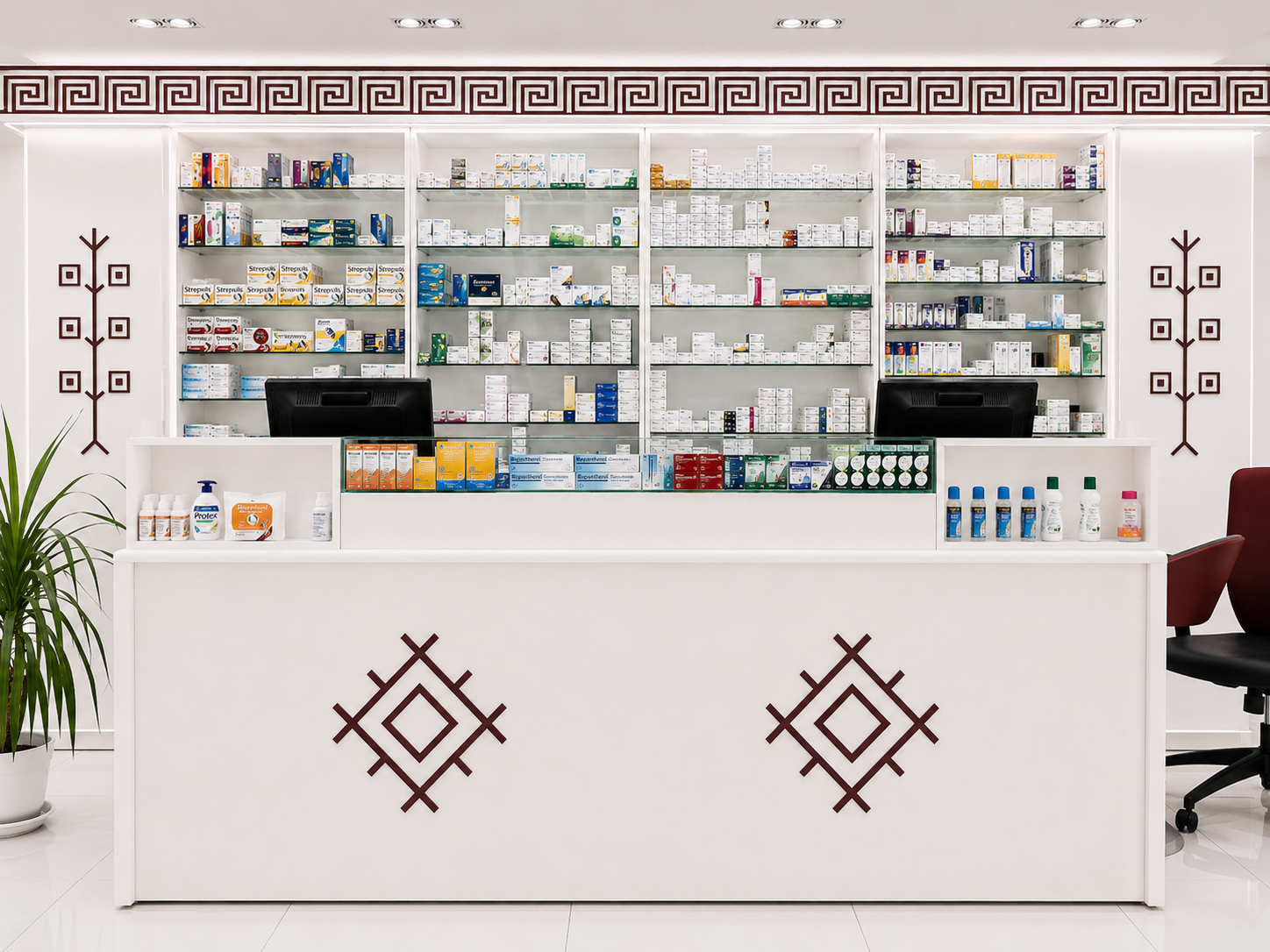
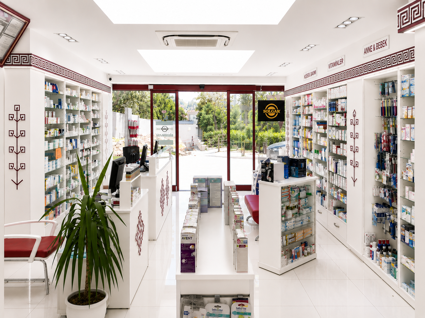
Completed in 2016 in Altunizade, Istanbul, Nurhayat Pharmacy was developed for a prominent location opposite a major hospital. The design responds to intensive daily use while giving the pharmacy a clear and memorable architectural character.
Perimeter Display Strategy
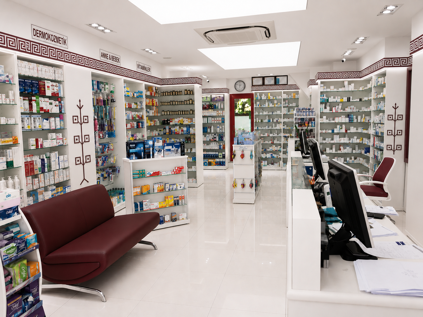
Continuous wall cabinetry uses the full perimeter of the interior for prescription, healthcare and retail products. This arrangement creates substantial display capacity while keeping the center of the pharmacy open and easy to navigate.
Clear Entrance-to-Counter View
From the entrance, customers can immediately identify the main service counter and product zones. Open sightlines reduce visual confusion and support a direct, uncomplicated journey through the pharmacy.
Burgundy Identity Band
A continuous burgundy geometric band wraps around the upper level of the interior, visually connecting the different display areas. The vertical motifs extend this identity onto selected columns and cabinetry surfaces.
Brightness with Controlled Contrast
White lacquered units, glass shelves and light-reflective surfaces establish a bright interior, while burgundy details and red seating introduce depth and contrast. The result is distinctive without becoming visually heavy.
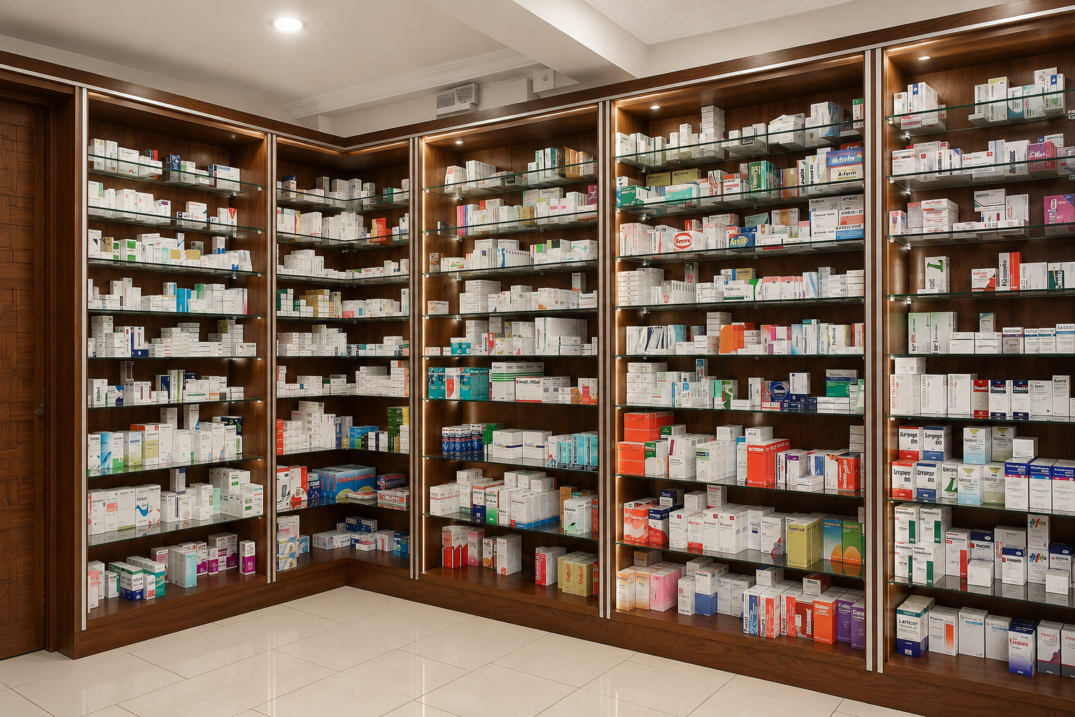
POLEN PHARMACY
Project Overview
Completed in 2010, Polen Pharmacy was designed beside a family health centre in a densely populated residential area. The interior was planned to manage continuous customer traffic while establishing a distinctive and sophisticated pharmacy identity.
Serving a Dense Local Community
The pharmacy’s position between a busy healthcare facility and surrounding residential developments creates strong daily demand. The counter, display areas and circulation route were organized to support both prescription service and direct retail sales.
Dark Timber Identity
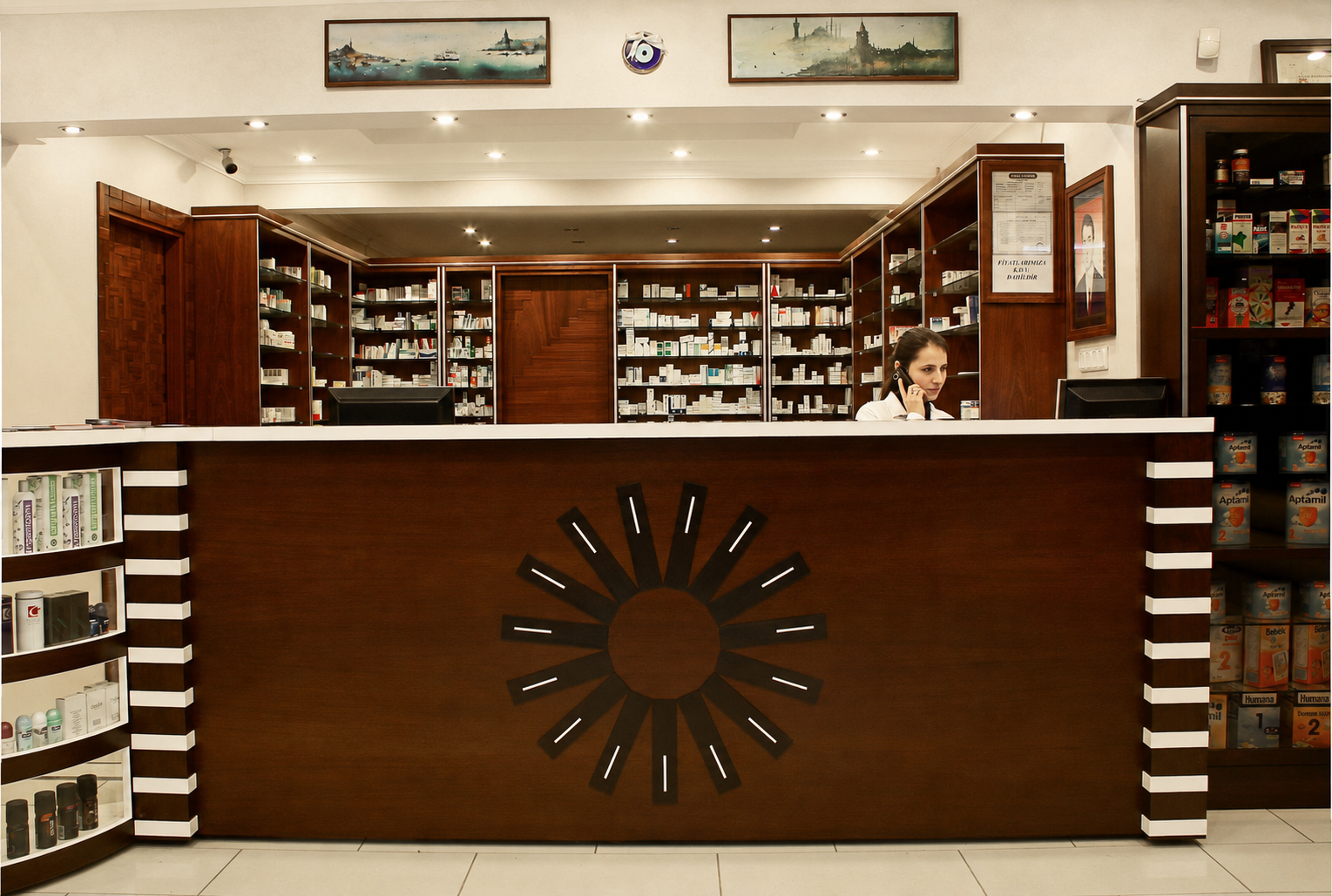
Deep-toned timber cabinetry gives the interior a warm, substantial and highly recognizable character. Continuous wood surfaces visually connect the counter, wall units and storage areas throughout the pharmacy.
Lighting as a Balancing Element
Integrated shelf lighting and carefully positioned ceiling illumination were used to balance the dark material palette. Products remain clearly visible while the timber surfaces gain depth without making the interior feel heavy.
A Counter as the Visual Anchor
The broad service counter forms the architectural centre of the pharmacy. Its illuminated radial detail, contrasting white countertop and integrated side displays turn a high-capacity working element into the project’s defining feature.
Sixteen Years of Continuous Use
The pharmacy has remained in active daily use since 2010. After sixteen years, the original cabinetry, counter and spatial organization continue to serve the demands of a busy neighborhood pharmacy.
SAFİR PHARMACY
Project Overview
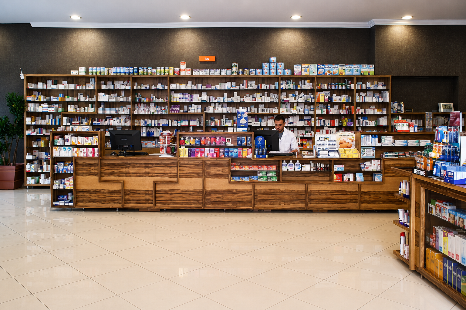
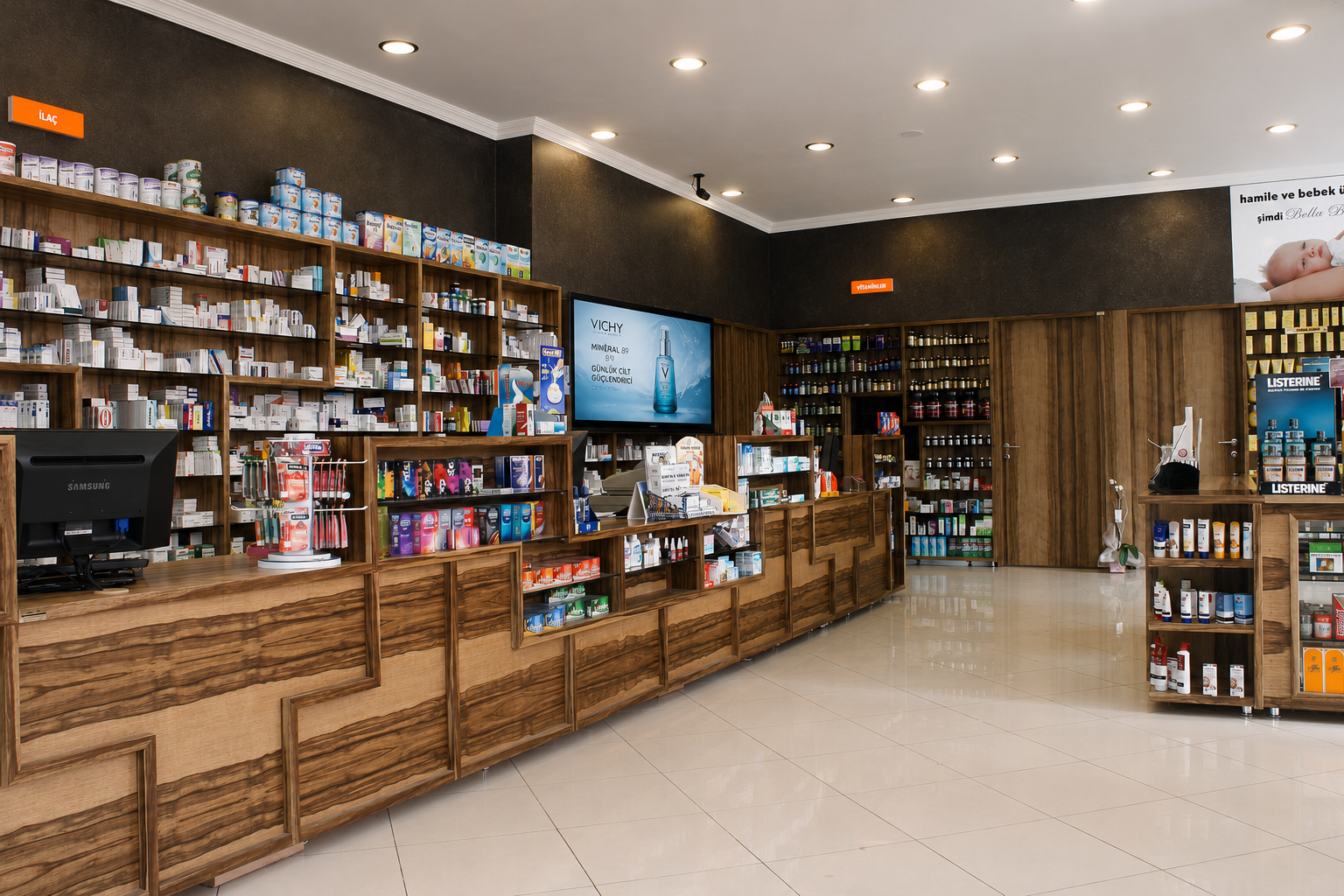
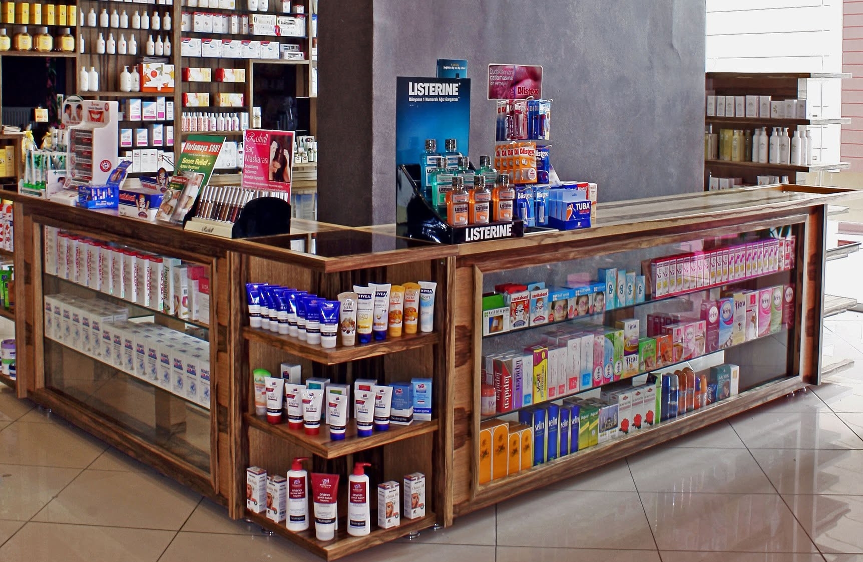
Completed in 2016 in Üsküdar, Istanbul, Safir Pharmacy was designed as a large-format pharmacy in a prominent street location, with an interior of approximately 200 square metres. Its high ceilings and generous floor area allowed prescription service, over-the-counter sales and premium dermocosmetic retail to operate together within a spacious and clearly organized interior.
A Spacious Retail Environment
Wide circulation routes and open product zones allow customers to browse comfortably without interrupting the main service flow. The layout uses the scale of the pharmacy to create an accessible retail experience rather than filling the interior with unnecessary furniture.
Premium Dermocosmetic Display
Extensive display areas were developed for premium dermocosmetic brands and high-volume retail products. Long wall units and clearly defined product categories provide strong visibility while allowing customers to compare and explore products with ease.
A Complete Brand Environment
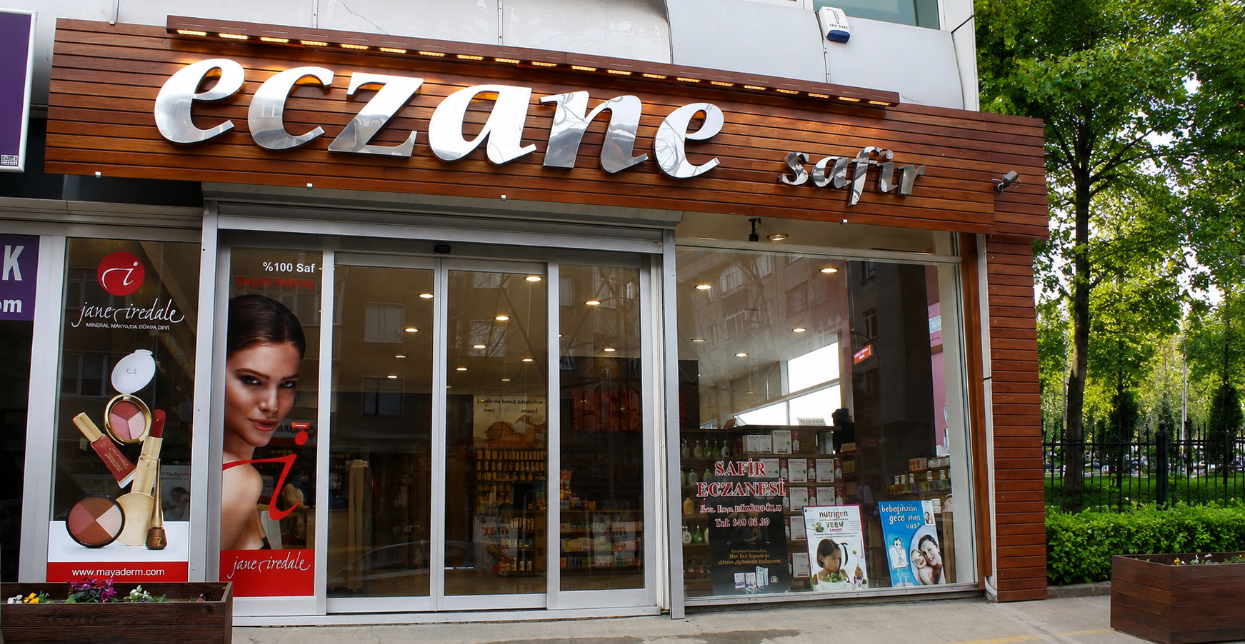
The project was developed as a complete architectural identity, including the interior, custom wood-veneered furniture, façade treatment and exterior signage. Every visible element was coordinated to establish a consistent and distinctive presence from the street to the interior.